YOUR PROFILE IS THE FIRST PAGE OF YOUR WEBSITE.
It is where a referral checks you before they ever reach your site, and most of them read like a content feed rather than a business. We rewrite the headline, the About and the Featured row around what you actually sell, then draw every picture the profile and the company page need.
- Profile and company page
- Every asset at LinkedIn's sizes
- A written guide, yours to keep
- No posting, no ghostwriting
IT SELLS YOUR POSTS, NOT YOUR OFFER.
- The headline says what you post about, not what you sell
- The picture was never made for the size it renders at
- Featured is empty, or it is a course badge from 2021
- The company page has no cover and last year's logo
ONE REBUILD, AND YOU CAN READ ALL OF IT.
This is the LinkedIn work we have shipped. One client, named, her site live, her own words. Nothing here is a follower count, because nothing about it was measured that way.
The one we have shipped
Aneta Kosinska
Founder, Lumineer · Toronto, Canada
- the brand actually feels like me now
- like i feel like i can finally be myself
- it's the strangest but coolest feeling
- way better!
Four messages, printed as they were sent.
The whole rebuild, before and after
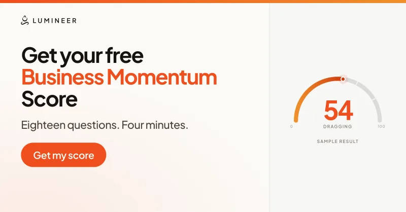



Banner, Featured card, company cover, profile picture and logo tile. Every one at the size LinkedIn asks for.
TODAY, AND AFTER.
| Today | After |
|---|---|
| A headline about what you post | One sentence naming the offer |
| A headshot against a wall | A picture that reads at 32px |
| Words in the corner the photo covers | 1584 x 396, safe area kept clear |
| One course badge in Featured | A card and a link for each thing you own |
| A company page with no cover | Cover, logo tile, overview, tagline |
| Nobody knows which file goes where | A written guide and the source files |
FOUR STEPS, NOT SEVEN.
- 01
We read what you have
Your profile, your page, your site. Before we ask you anything.
- 02
One call about the offer
Not design. What you sell and who to. The headline comes out of it.
- 03
Words, then pictures
Copy first, or the banner gets drawn twice. You pick from alternates.
- 04
The folder and the guide
Named, cut to size, in upload order, with the copy to paste.
TWO PACKAGES.
Starting prices
Revamp
You have a brand. We work inside it.
From$900
- Headline, About and Featured rewritten
- Every asset redrawn at LinkedIn's sizes
- A written guide, in your existing brand
Brand from scratch
There is nothing to work inside yet.
From$2,200
- Colour, type and a mark, drawn for you
- Everything in Revamp, in the new brand
- Full brand guidelines and the source files
Fixed scope and a fixed number before anything starts. Cheaper alongside a website build than as its own project, and there is no retainer.
- Fixed scope, fixed price, in writing
- No retainer, no posting bolted on
- If the profile mostly works, we say so
WHAT PEOPLE ASK FIRST.
No, and they are usually sold by different people. Ghostwriting is somebody writing your posts every week, ongoing. This is a one-off rebuild of the profile itself: the headline, the About, the Featured row, the pictures and the company page. We do the second and not the first, and if posting is what you actually need we will point you at somebody who only does that.
1584 by 396 pixels, and the size is the easy part. Your profile picture covers the lower left corner, and it covers more of it on a phone than on a desktop, so nothing readable should start before about 500 pixels in. That is why so many banners look fine in the editor and have their first three words hidden in the feed.
1000 by 1000 pixels, cropped to a circle by LinkedIn. What matters more is that it renders as small as 32 pixels in search results and about 48 in the feed, so a headshot with a room behind it turns to mush. A cutout on a flat colour still reads at the smallest size, which is why we draw them that way.
1200 by 627, rendered about 350 pixels wide, so each one carries a single heading and no body copy. LinkedIn shows two at a time and scrolls the rest, so the order matters more than the count: put the free thing first and the booking link second. The title and the link under each card are typed in at upload, not baked into the image.
1128 by 191, with a 300 by 300 logo tile that hangs off its lower left, so the cover has to keep its first 208 pixels clear. Also pair a dark logo with a light cover: an orange mark on an orange cover disappears entirely, which is the single most common company page mistake we see.
Name what you sell and who it is for, in one sentence, in the first person. Most headlines describe the content the person posts or list three job titles separated by pipes, neither of which tells a stranger whether to contact you. The headline follows you into every comment, every search result and every connection request, so it is the highest-leverage line you own.
Yes, because it appears beside your name on every post you make, and an empty one with no cover reads as a business that folded. It does not need much: a cover, the logo tile, a tagline that matches your site and an overview that says what the company does rather than who might read it. It is a common request on its own, without touching the personal profile.
They should be the same brand, yes, and this is where most people lose. Your profile is checked before your site, so if the two disagree the buyer trusts the smaller, scruffier one. Same palette, same typeface, same mark, and the profile's Featured links pointing at pages that actually exist.
Shorter than a website. It runs on four steps: we read what you already have, one call about the offer, the words, then the pictures. Copy comes before design because a banner drawn before the headline is settled is a banner drawn twice.
Never, and you should not give account access to anyone. Everything arrives as a folder of files at the sizes LinkedIn asks for, sorted into the order you upload them in, with a document listing what to change and the copy to paste. The uploading takes about ten minutes and you do it.
Then it is cheaper and faster, because the palette, the typeface and the mark are settled and the work is applying them properly. What you are buying is the words and the sizes, which is where almost all of the damage is anyway. If you have no brand, drawing one is part of the job rather than a second project.
You will not be choosing from one. Every asset comes as a small set of alternates drawn in the same system, so the decision is which one rather than whether. On the Lumineer rebuild that was four banners, three profile pictures, four covers and four logo treatments.
Send us your profile.
Paste the link with a line about what you actually sell. We will tell you which of the eight things is wrong with it, and whether it is worth paying anybody to fix.