
On this page (13)
- 01The short answer
- 02What a profile view actually is
- 03Reason 1: the people viewing you are peers, not buyers
- 04Reason 2: the headline sells your posts, not your offer
- 05Reason 3: the banner spends the biggest space on an abstraction
- 06Reason 4: the About section starts with you, not with them
- 07Reason 5: the Featured section sends people nowhere
- 08Reason 6: there is no next step for a cold visitor
- 09Reason 7: the profile, the company page and the website disagree
- 10Check yours in ten minutes
- 11What does not fix it
- 12One profile, before and after
- 13Where to start
You open "who viewed your profile" and the list looks promising. A founder, a head of operations, someone at a company you would love to work with. Then nothing. No message, no connection request, no enquiry through your website.
Most advice about LinkedIn profile views but no messages is written for job seekers waiting on recruiters. This is for the other group: consultants, coaches, speakers and founders who sell a service and use LinkedIn to find the people who buy it. The reasons are different, and so are the fixes.
The short answer
A view with no enquiry almost always means the profile answered the wrong question. The person who clicked wanted to know three things: what you sell, who it is for, and how to start. Most profiles answer a different three: who you are, what you post about, and where you have worked.
There are seven places that goes wrong, listed below in the order a visitor meets them. The first two are about who is looking. The other five are about what they find. Fix the headline and the next step before anything else, because those two do most of the work.
What a profile view actually is
A view is somebody deciding whether you are worth a conversation, usually in under a minute. Where they came from changes what they are looking for.
| Where the view came from | What they want to know | What they look at first |
|---|---|---|
| Your post or comment in their feed | Is this person worth following, or hiring? | Headline, then the banner |
| A referral, before a call | Is this the person I was told about? | Headline, About, then your website |
| A search for a service | Do they do the thing I need? | Headline in the search result |
| Someone selling to you | Are you a prospect? | Nothing, they will message you anyway |
| An automated tool | Nothing | Nothing |
Two things follow from that table. Not every view is a buyer, so a high count on its own means less than it feels like. And the headline is the one thing every real visitor reads, which is why it comes up again and again below.
LinkedIn also shows you only part of the list. A free account shows a handful of recent viewers, and anybody browsing privately appears without a name. The count tells you whether people are arriving. It does not tell you who they are.
Reason 1: the people viewing you are peers, not buyers
Open your viewer list and read the job titles, not the count. If most of them do what you do, your profile is being found by colleagues, competitors and people learning your trade. That is pleasant and it pays nothing.
This usually happens because the posts that bring people to the profile are written for other practitioners. A consultant who writes about consulting technique attracts consultants. A buyer reads about their own problem, not about your method.
How to check: look at the last ten viewers you can see. Count how many could plausibly hire you. If it is two or fewer, the profile is not the first problem, the audience is.
Choosing that audience is a decision, not a design job. When we rebuilt Aneta Kosinska's banner for Lumineer, we drew the same banner four times, each one naming a different reader. Here are two of them:
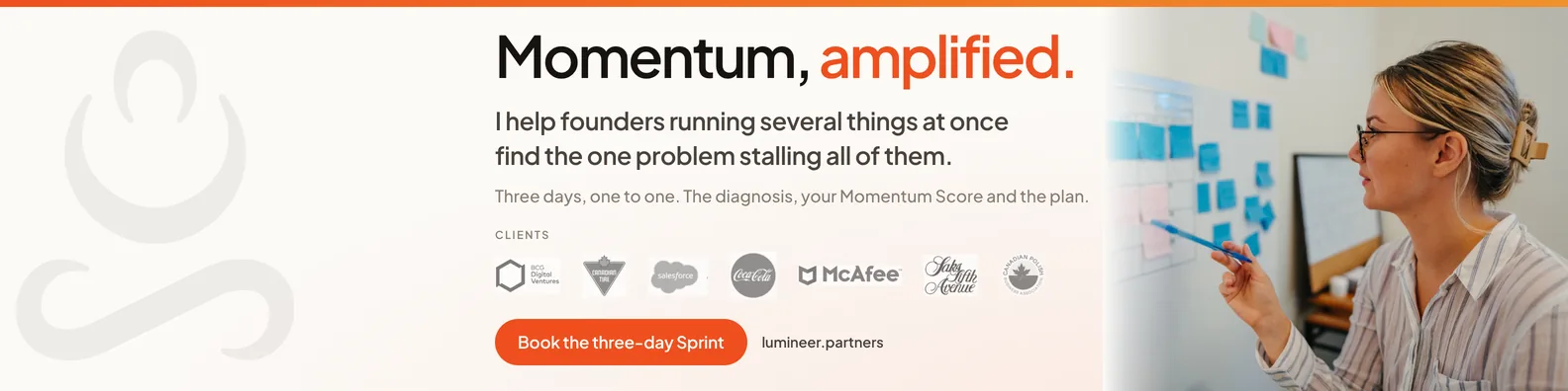
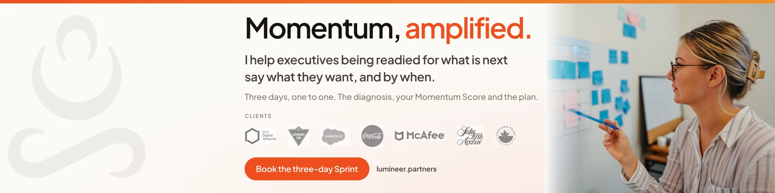
Same design, same offer, two different buyers. A profile can only speak to one of them at a time, and whichever one it picks, the posts have to be talking to that same person, or the wrong people keep arriving.
Reason 2: the headline sells your posts, not your offer
This one is the easiest to miss on your own profile, because you already know what you sell.
Here is a real one, from a client, before we rebuilt it:
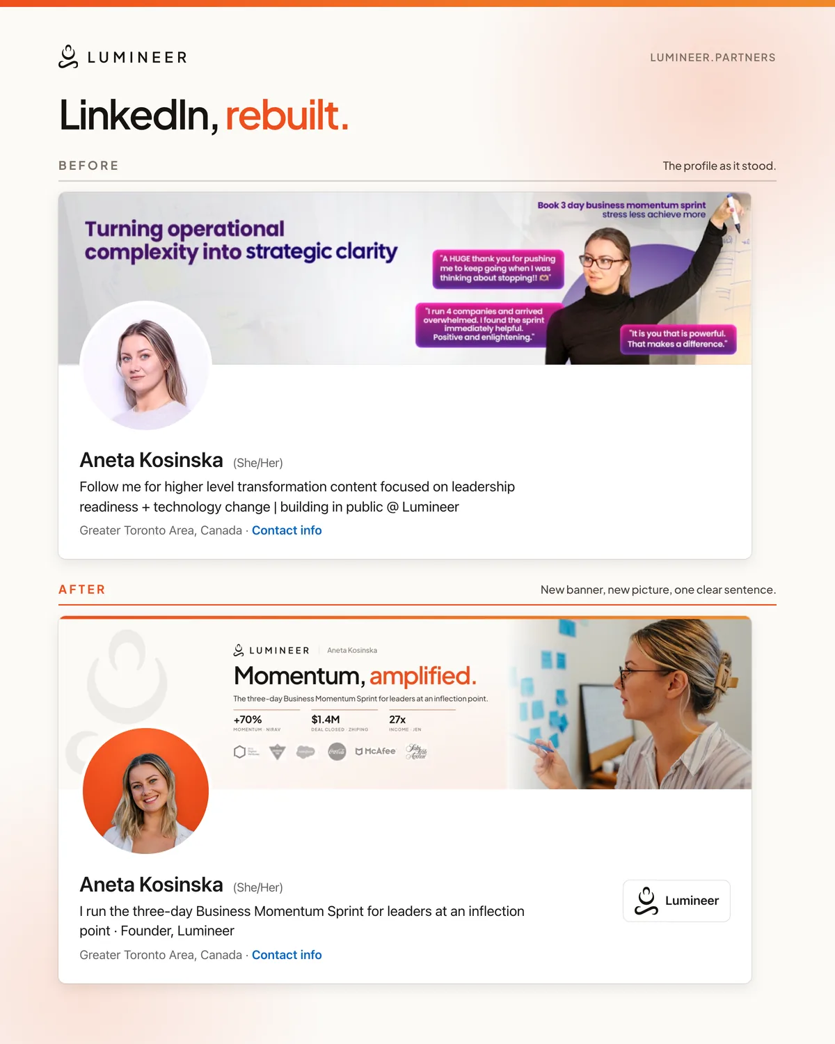
Follow me for higher level transformation content focused on leadership readiness + technology change | building in public @ Lumineer
It asks the visitor to follow. It describes the content. It never says what Aneta Kosinska actually sells. This is the version after:
I run the three-day Business Momentum Sprint for leaders at an inflection point · Founder, Lumineer
One offer, named. Who it is for, named. A stranger can now decide in one read whether they are the person she helps, which is the only decision a headline has to make possible.
Here are both versions the way a visitor meets them, with the new banner and picture alongside the new headline:
How to check: read your headline as somebody who has never met you. Could they say back to you what they would be buying? If they would say "content about leadership" or a list of three job titles, they cannot. How to write one that does is on our LinkedIn brand overhaul page.
Reason 3: the banner spends the biggest space on an abstraction
The banner is the largest thing on a profile, and most of them are a stock photograph, a default gradient, or a sentence like "turning complexity into clarity" that could belong to anybody.
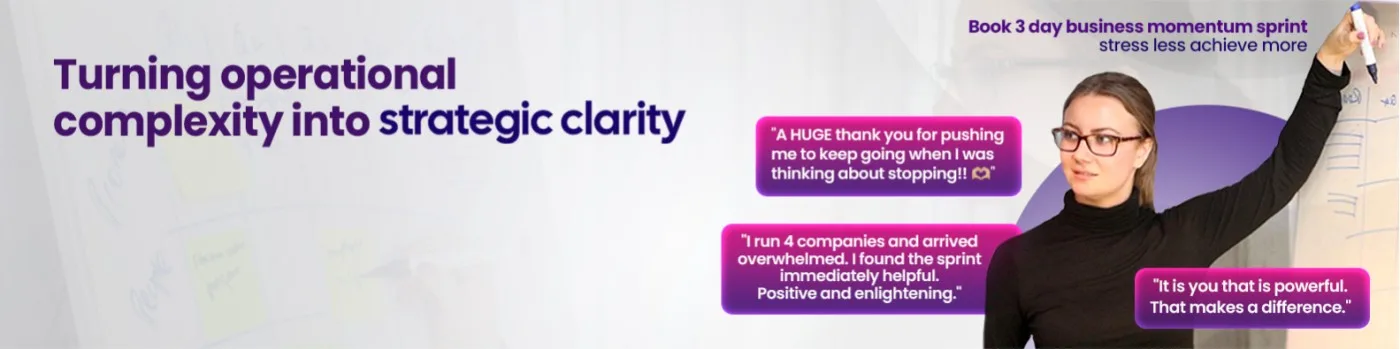
That was Lumineer's. It is tidy and it says nothing a visitor can act on. The replacement names the offer, shows her at work and puts proof along the bottom:
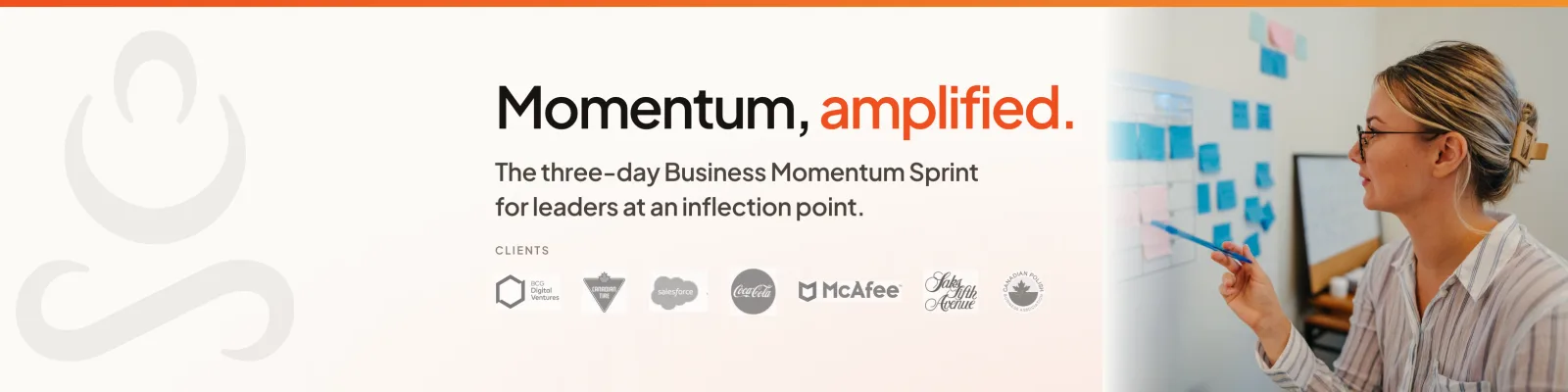
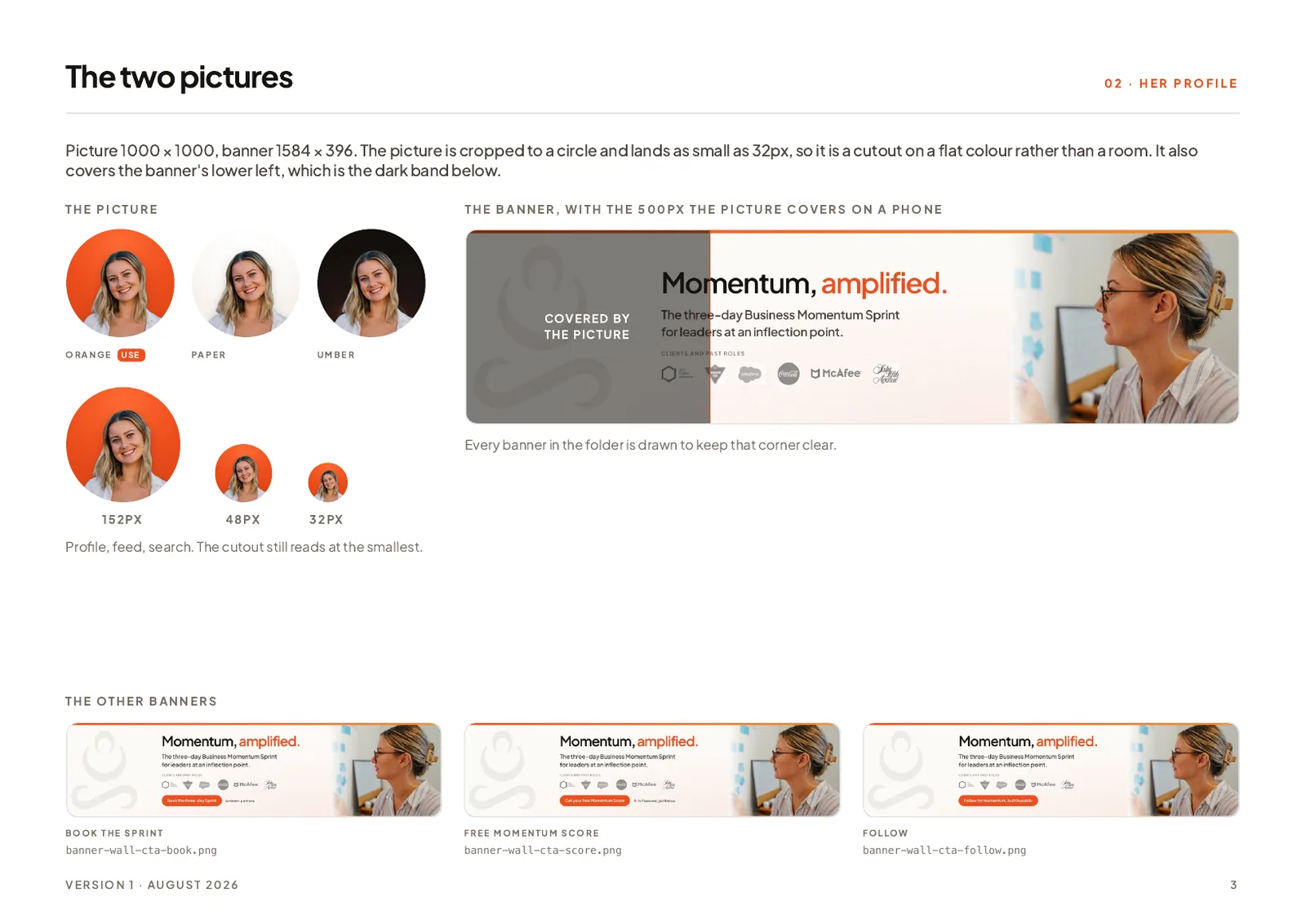
The picture matters as much as the banner, for two reasons most people miss. It shows as small as 32 pixels in search results, where a headshot with a room behind it turns to mush. And on a phone it covers the lower left of the banner, so anything written there disappears. This page from her LinkedIn guide shows both:
How to check: cover your headline with your thumb and look at the banner alone. Does it tell a stranger what you sell, or only what colour you like? On a phone, also check that your photo is not sitting on top of the one line that mattered.
Reason 4: the About section starts with you, not with them
LinkedIn shows the first few lines of the About section and folds the rest behind "see more". Most people spend those lines on a career story: "I have spent fifteen years in…". The visitor who came to find out whether you can help them has to click to find out, and most do not.
How to check: read only the lines that show before "see more". Do they name the problem you solve and who has it? If they would fit on anybody's profile in your industry, rewrite the opening and leave the history for lower down.
Reason 5: the Featured section sends people nowhere
Featured is the only part of a profile that can send a visitor somewhere you choose. On most profiles it holds a certificate, an old post that did well, or nothing at all.
Lumineer's held one certification and no links. It now holds four cards: a free self assessment, a call, the results page and an e-book. That is a set of next steps sized to how ready the visitor is, which matters more than how good the cards look.
This is the row as it sits on her profile. LinkedIn shows two cards at a time and scrolls the rest, so the free score and the call go first:
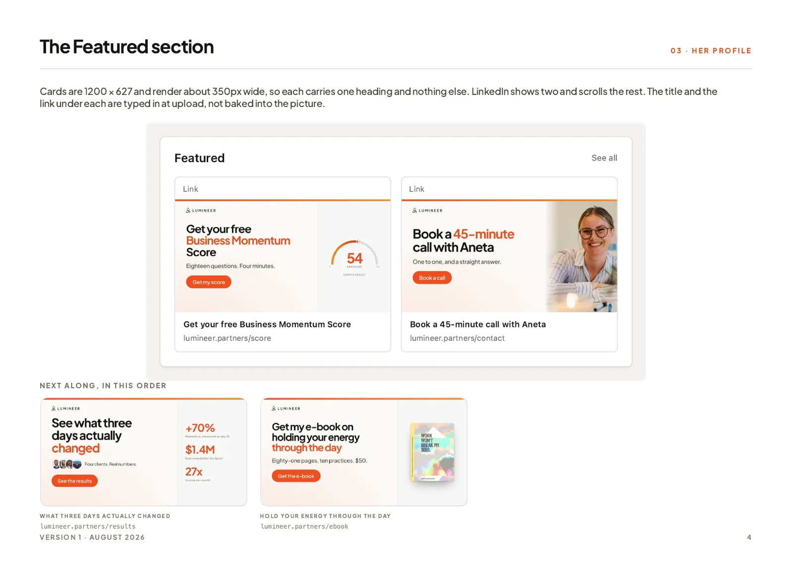
How to check: look at the first two items, which are the ones LinkedIn shows without scrolling. Is at least one of them a step a stranger could take today?
Reason 6: there is no next step for a cold visitor
Somebody who has just found you is not ready to book a call with you. If the only route forward is "message me", most of them will not take it, because writing to a stranger is effort and it feels like a commitment.
Three things to look at:
- Your website is missing from Contact info. It is free, and it is where a careful buyer goes next. If they cannot find it, many of them stop there.
- There is no smaller step than a call. A guide, a self assessment or a short email series gives a not-yet-ready visitor something to do that is not leaving.
- The services section is empty. Listing what you provide, through the "Open to" button on your profile, puts it in front of people searching for that service. A button on the profile itself needs a paid plan, but the section does not.
How to check: pretend you are interested but not ready. What can you do in the next two minutes that is not messaging a stranger?
Reason 7: the profile, the company page and the website disagree
A visitor who likes your profile usually checks one more thing before writing to you. Often it is your website. Sometimes it is the company page beside your name. If the profile sells one thing, the site sells three and the company page has no cover and an old logo, the visitor stops trusting whichever looks scruffiest, and that is usually the one that matters.
Lumineer's company page had no cover at all, the retired logo, and an overview that described its readers rather than its work. All three were fixed in the same rebuild as the profile, out of one palette, so every place a buyer checks says the same thing.
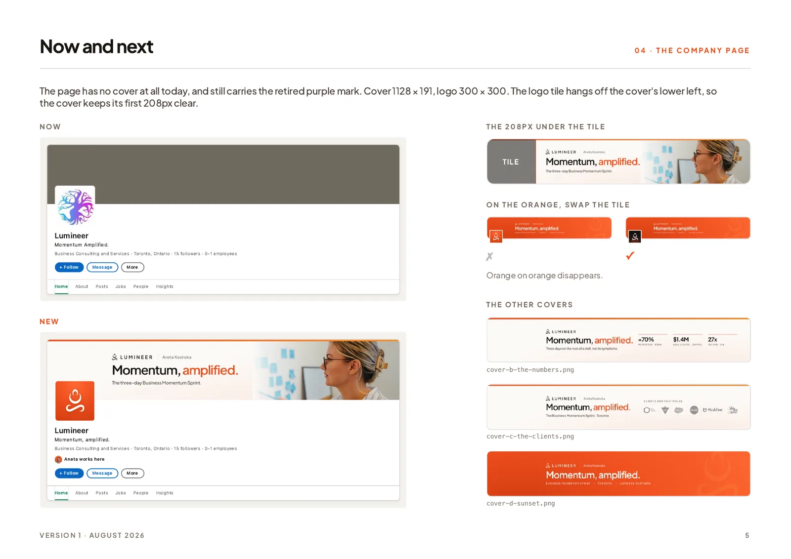
How to check: open your profile, your company page and your website side by side. Would a stranger know they belong to the same business, selling the same thing?
Check yours in ten minutes
| Where | What to check | It passes if |
|---|---|---|
| Profile views | Job titles of the last ten viewers | At least a few could hire you |
| Headline | Read it as a stranger | They can say what you sell and to whom |
| Banner | Look at it with the headline covered | It names the offer or shows the work |
| About | Only the lines before "see more" | They name the reader's problem |
| Featured | The first two items | One is a step a stranger can take today |
| Contact info | Is your website there? | Yes, and it is the right page |
| Services | Is the section filled in? | It lists what you actually sell |
| Company page | Cover, logo, overview | All current, and all about the work |
| Website | Open it from the profile | It sells the same thing the headline does |
If more than three of those fail, the profile is costing you enquiries, however many people look at it.
What does not fix it
Posting more. More posts bring more people to the same profile. If the profile does not convert, you have made the leak bigger, not smaller.
Buying a premium plan for the button. A button on a profile that does not say what you sell gets clicked by nobody. Fix the words first.
Rewriting your work history. Buyers rarely read it. It is the last thing on the page for a reason.
A note on what we do, because it is relevant here. We rebuild profiles and company pages. We do not write posts for anyone. If your real problem is reason 1, the posts, you need a writer or a different topic, not us, and we will say so if you ask.
One profile, before and after
The examples above all come from one rebuild, and it is written up in full in the Lumineer case study: eight changes, four on the profile and four on the company page, nineteen files cut to the sizes LinkedIn asks for, and the brand they were drawn from.
This is the page of the guide she was handed that lists every one of those changes, with the old text, the new text and the file to upload:
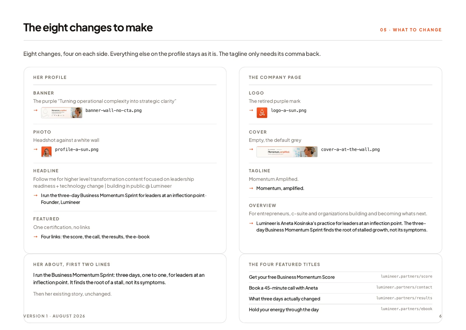
We have not measured what the rebuild did to her enquiries, so we are not going to quote a number. What the case study shows is the change itself, field by field, with the reason for each one. That is the part you can copy.
Where to start
Do the ten minute check above. Then fix things in this order, because each one makes the next one worth doing:
- The headline. One sentence: what you sell and who it is for.
- The next step. Your website in Contact info, and one smaller step than a call.
- Featured. Two items a stranger can act on, at the front.
- The banner and the company page, once the words are settled, so nothing gets drawn twice.
If you would rather have it done, that is the job of a LinkedIn brand overhaul: the headline, About, Featured, banner and company page rebuilt around what you sell, delivered as a folder of files and a guide, with no access to your account. What it costs is in how much a custom website costs, which covers the profile alongside the site. And if the profile is fine but the website it sends people to is the weak link, that is a personal brand website.

Nitesh Padghan
Founder, Storifex Media
I build websites that turn visitors into revenue, and rebuild the LinkedIn profiles that send people to them. Clients in six countries, most of them shipped in two weeks.
Connect on LinkedInRelated reading
- Redesigns and migrations
How to redesign a website without losing your search traffic
The redirect map is the whole job. Where to pull every old URL from, what has to move and what must not, launch day in order, and the fortnight after.
Read - Redesigns and migrations
Traffic dropped after a website redesign: how to find out why and get it back
Check the drop is real, find the pages that lost it, then work through the five usual causes in order. A recovery checklist for a site that lost traffic in a rebuild.
Read - Personal websites
Author website examples: what six non-fiction authors do right
Six author websites from non-fiction and business writers, what each one does that most author sites do not, and the one idea worth taking from each.
Read