

On this page (12)
- 01The short answer
- 02Seven sites at a glance
- 03April Dunford: one door for each kind of buyer
- 04Jonathan Stark: a ladder from free to paid
- 05Derek Sivers: a page that says what you are doing now
- 06Ann Handley: a page for the person who books you
- 07Dr. Mike Zhang: talk to the situation the reader is in
- 08Wisdom Made Easy: show the work in the form it takes
- 09Lumineer: let people test themselves before they talk to you
- 10What the weak ones have in common
- 11How to borrow without copying
- 12Where to start
Most lists of personal website examples are a gallery of nice screenshots. That is fine if you are choosing a colour. It does not help if you are a consultant, coach or speaker trying to work out why somebody else's site gets enquiries and yours gets a polite visit.
So this is a different kind of list. Seven sites, what each one does that most personal sites do not, and the one idea worth taking from each. Three of them are sites we built. We say which, and why they are here anyway.
The short answer
The good ones are rarely the prettiest. What they share is that the first screen answers three questions before the visitor has to scroll:
- Who is this for? Not who you are. Who you help.
- What do you do for them? In their words, not your job title.
- What should I do next? One obvious step, sized to how ready they are.
Then each of them does one thing unusually well. That one thing is what you should borrow. Borrowing all seven gives you a site that looks like a committee designed it.
Seven sites at a glance
| Site | Who it is for | What it does well | Steal this |
|---|---|---|---|
| April Dunford | B2B tech teams | Splits visitors by why they came | One door per kind of buyer |
| Jonathan Stark | Independent professionals | Lets you start small | A ladder from free to paid |
| Derek Sivers | Readers, mostly | Says what he is doing this month | A now page |
| Ann Handley | Event organisers, readers | Looks after the person booking her | A page for whoever books you |
| Dr. Mike Zhang | People who gamble, and their families | Talks to the reader's situation | Sort by situation, not by service |
| Wisdom Made Easy | Readers and clients | Shows the work as it really looks | Show the work in its own format |
| Lumineer | Founders who feel stuck | Gives before it asks | Let people test themselves first |
April Dunford: one door for each kind of buyer
April Dunford's site is the clearest example we know of a consultant who sells several things to several kinds of people without the homepage turning into a menu.
The title tag alone does work most sites skip: it names the niche, positioning for B2B tech companies, so the right visitor knows they are in the right place before the page has loaded. The navigation then splits by why you came. Consulting, speaking, books, templates. Each one is a separate page written for a separate buyer. The consulting page talks to an executive team about a three day workshop. The speaking page talks to an event. Neither has to compromise to suit the other.
Steal this: if more than one kind of person pays you, give each of them a door. A company hiring you to consult and a conference booking you to speak are asking different questions, and one page cannot answer both well.
Jonathan Stark: a ladder from free to paid
Jonathan Stark opens on the reader's problem rather than his credentials. The page is about getting off the hourly hamster wheel, and his name arrives after you already care.
The part worth copying is near the top: three ways he can help, in order of commitment. Read the daily emails. Read the book. Get private help. A visitor who is curious but nowhere near hiring anybody has an obvious first step, and the visitor who is ready has an obvious last one.
Most personal sites offer exactly one step, book a call. That suits the few visitors who are ready today and loses everybody else.
Steal this: give people a smaller step than hiring you. A newsletter, a free guide, a short assessment. The point is to keep everybody else within reach until they are ready.
Derek Sivers: a page that says what you are doing now
Derek Sivers keeps a plain site, and it works because of how it lets you choose your depth. There is a version of him in ten seconds, another in ten minutes, and then everything else.
The idea that spread from his site is the now page: a single page saying what he is focused on at the moment, dated at the top. It started there and is now common enough that there is a directory of them.
A now page solves a problem every personal site has. Most of the site is evergreen, which is good for search and bad for proving you are still active. A dated page that changes every month or two tells a visitor you are working, where you are and what you are taking on, without a blog you have to keep feeding.
Steal this: add a now page and put its date where people can see it. If it says you are booking projects for the spring, that is a call to action that does not feel like one.
Ann Handley: a page for the person who books you
Ann Handley is a writer and keynote speaker, and her site treats the event organiser as a separate audience with separate needs.
There is a page for meeting planners that exists to make their job easier once she is booked: high resolution photos, the official bio, book resources, everything needed to promote the session. It is not a sales page. It is a service page for somebody who has already said yes, and it makes saying yes again the easy option.
Speakers lose bookings to small frictions. A planner who has to email for a headshot, then for a bio that fits the programme, then for the right book cover, remembers the work, not the talk.
Steal this: find the person who has to do admin to work with you, and give them a page. For a speaker it is the planner. For a consultant it may be the procurement contact who needs your company details and insurance in one place.
Dr. Mike Zhang: talk to the situation the reader is in
We built Dr. Mike Zhang's site, so take this one with that in mind. It is here because it does something most coaching sites get wrong.
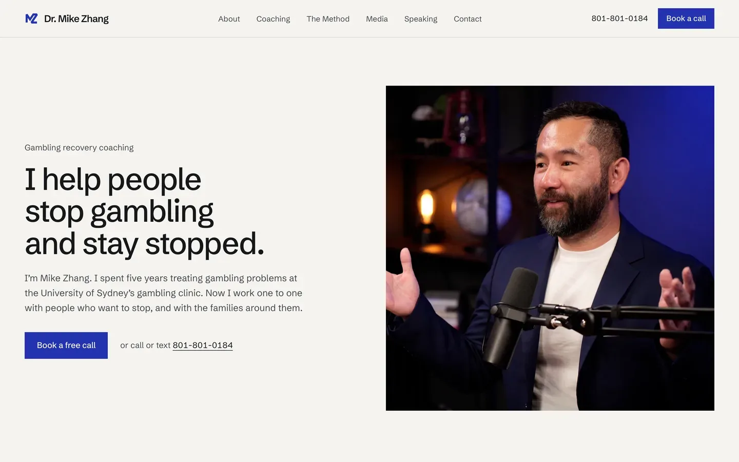
Most coaches organise their site around their services: one to one, group, workshops. Mike's visitors do not think in services. They think in situations. So the page sorts them that way. You are still gambling. You have stopped, but it has not left you. Someone you love is gambling. Each one is a sentence the reader recognises as their own, and each has its own next step.
The other detail is the phone number in the header. For most consultants a phone number up top would be noise. For somebody deciding at eleven at night whether to ask for help, being able to call or text without filling in a form is the difference.
Steal this: if your clients arrive in different situations, name the situations and let them find themselves. And make the next step match how the person is feeling, not how you like to take enquiries.
Wisdom Made Easy: show the work in the form it takes
Another one of ours. Michael J Boorman turns complex ideas into hand drawn visuals, including for New York Times bestsellers.
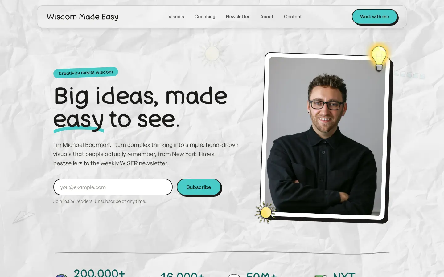
A site describing visual work in paragraphs would be the wrong site. So the homepage is built out of the work itself: the visuals, short videos of him breaking ideas down, the illustrations behind a bestseller, and the weekly newsletter that carries the same work. The offer of coaching and commissions sits among them rather than in place of them, so a visitor judges the work by seeing it.
Steal this: show the work in its natural format. A speaker's work is video. A writer's is writing. An illustrator's is pictures. A consultant's is often a before and after. A paragraph describing your work is the weakest possible version of it.
Lumineer: let people test themselves before they talk to you
The third of ours. Lumineer is Aneta Kosinska's practice, for leaders whose business has stalled.

The problem with selling to somebody who feels stuck is that they often cannot say what is wrong, so they cannot judge whether you can fix it. Her site answers that with a self assessment: eighteen questions, about four minutes, and the score appears without asking for an email address.
That last part matters more than it sounds. An assessment that hides the result behind an email form is a lead magnet, and visitors know it. One that gives the answer first earns the conversation that follows. Each client story on the site then has its own page, under the client's own name, so a visitor who recognises their situation can read one all the way through.
The full rebuild, including her LinkedIn, is written up in the Lumineer case study.
Steal this: give a visitor a way to learn something about their own situation before they talk to you, and do not charge an email address for the answer.
What the weak ones have in common
The examples above are the minority. Most personal sites we are asked to look at share the same handful of problems, and none of them is about design.
| What you see | What it tells a visitor |
|---|---|
| A headline that is your name and three job titles | Who you are, not what you do for them |
| One page listing every service | You have not decided who you are for |
| Testimonials with first names only | Nobody will check, so nobody believes them |
| A blog whose last post is from 2023 | The business may have stopped |
| Book a call as the only next step | Come back when you are ready to buy |
| A photo from several jobs ago | The site is not looked after |
Every one of these is fixable in an afternoon. The headline is the one to fix first, because it decides whether anything below it gets read. Our guide to why websites get traffic but no enquiries goes through the order to fix the rest.
How to borrow without copying
Pick one idea from this list, not seven. The sites above work because each of them did a small number of things deliberately, not because they did everything.
To choose, ask which of your visitors you are losing now. If people read and leave without a word, you probably need the ladder. If different kinds of client arrive confused, you need the doors. If the visitors who do get in touch are nowhere near ready to buy, you need the self assessment. If you speak, you need the page for planners whatever else you do.
Then check the idea against your buyer, not against the example. A now page suits somebody whose work changes month to month. It does not suit a firm whose offer has been the same for ten years, and a stale one is worse than none.
Where to start
Open your own homepage on your phone and read only what fits on the first screen. Does it say who you help, what you do for them, and what to do next? If any of the three is missing, start there before you borrow anything from anybody.
If you are not sure you need a site at all yet, our free do I need a website? check will tell you, and it is perfectly willing to say no. If you do, our page on personal brand website development shows the sites we have built for consultants, coaches, speakers and founders, and what a custom website costs has the prices, published.

Nitesh Padghan
Founder, Storifex Media
I build websites that turn visitors into revenue, and rebuild the LinkedIn profiles that send people to them. Clients in six countries, most of them shipped in two weeks.
Connect on LinkedInRelated reading
- Websites that convert
How to screenshot a whole web page
Why full page capture keeps coming back striped and half loaded, the five ways to do it properly, and what the image is worth once you have one.
Read - Websites that convert
What a slow website is costing you
Work out your own number in five minutes, find where the seconds go, and fix them in the order that pays back fastest.
Read - Automation
What to automate first in a service business
A scoring method for picking the right job, the six worth doing early, and the ones you should deliberately leave alone.
Read